A conversion-optimised D2C Shopify store
A modern, conversion-optimized D2C Shopify store for a premium socks brand featuring bundled products and an effortless shopping experience.
Overview
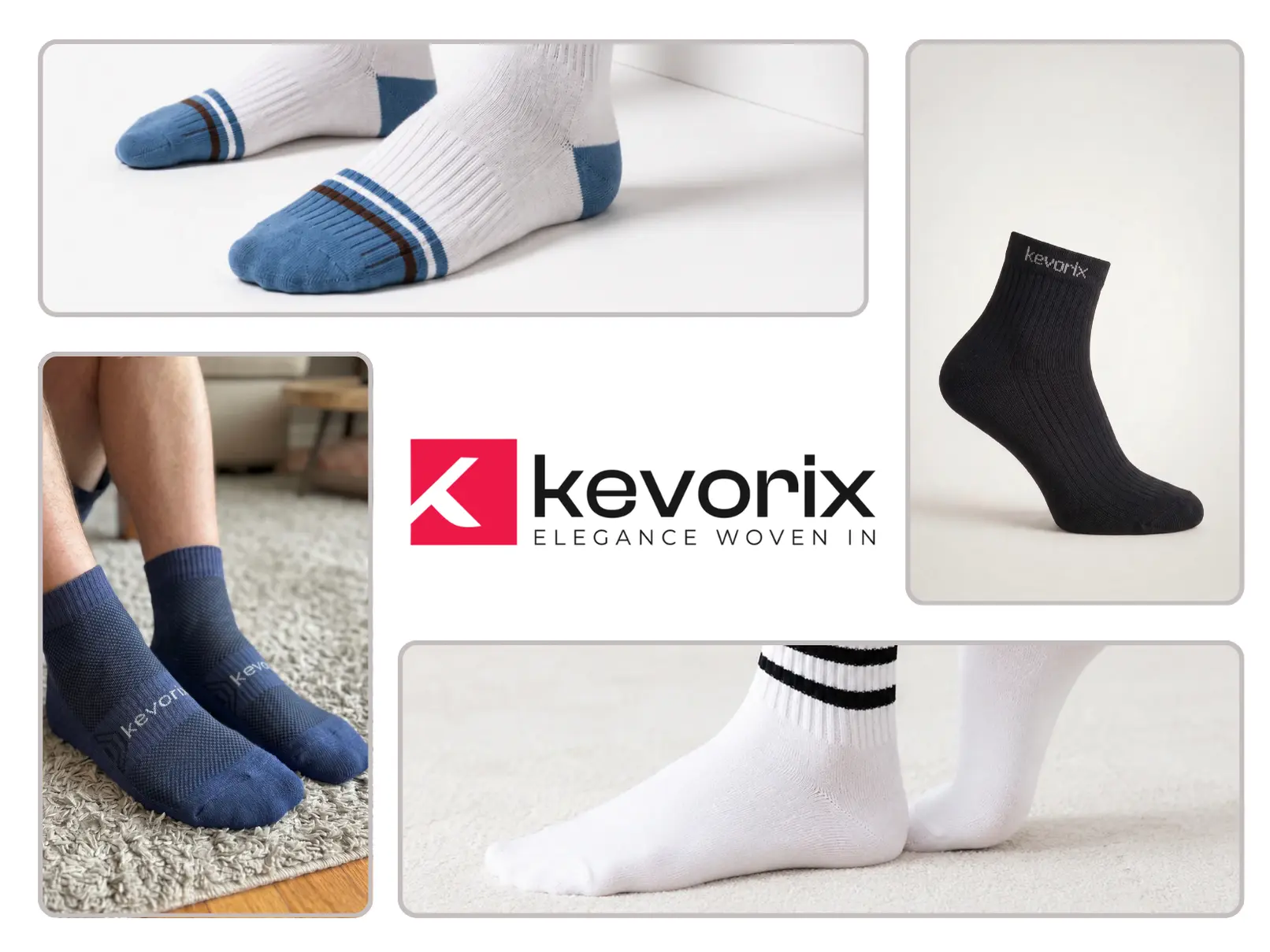
Kevorix is a premium socks label built for people who care about how a well-considered wardrobe feels. The brand had a clear point of view — considered materials, thoughtful patterns, and a colour palette that rewards repeat purchase — but their existing storefront could not carry that story. Our brief was to build a Shopify store that reflected the product's quality, made bundling the default rather than an afterthought, and drove measurable improvement across every step of the funnel.
The finished store is a modern, conversion-optimised direct-to-consumer experience that feels effortless to shop and easy to operate. It is built on Shopify with a lightweight custom Liquid theme, tuned for mobile-first performance, and shaped around one central idea: the sock is a system, not a single unit.
The Challenge
When Kevorix came to us, their storefront was a stock Shopify theme with heavy apps stacked on top. Load times on 4G were slow, the product detail page pushed customers toward buying a single pair, and the bundle logic was hidden behind a third-party app that broke the visual language of the brand every time it appeared. Analytics told the story clearly: high traffic, decent add-to-cart rates, but average order value stuck below the level the brand needed to be sustainable at its price point.
The team also needed operational relief. Content updates required a developer, seasonal launches were stressful, and the marketing team could not spin up a campaign landing page without waiting on engineering. The store had to be beautiful and fast, but it also had to give the team leverage.
Our Approach
We started with a two-week discovery: recorded session replays, funnel analytics, competitive teardown, and a series of conversations with the Kevorix team about the customer they actually wanted to serve. From that work, we built a single strategic thesis — Kevorix would be the brand that made buying socks in thoughtful sets feel obvious, and every design decision would ladder up to that idea.
We then designed a token-driven visual system in Figma, mapped it onto Shopify's theme architecture, and rebuilt the store from scratch in Liquid. Every third-party app was audited; anything that could be replaced with native, first-party code was replaced. The result is a theme that is fast by design, not fast in spite of itself.
Design System
The visual identity leans into what makes premium socks feel premium: quiet type, generous negative space, and photography that centres texture and weave. We built a small, tight component library — cards, chips, buttons, price stacks, badges — and used it consistently from the homepage through the cart drawer.
Colour and typography are treated as a single system. A restrained neutral palette anchors the store, with a single brand accent used sparingly to draw attention to the actions that matter most: add bundle, edit bundle, and checkout. Motion is subtle and functional — a soft cross-fade between product images, a gentle scale on the primary CTA, and nothing that competes with the product itself.
A Bundle-first Product Page
The product detail page is the heart of the store, and it is where we placed our biggest bet. Instead of the default 'select variant, add to cart' flow, we designed a bundle-first experience: customers land on a curated three-pair set by default, with the option to swap any pair for another design in a single click.
This changes the shape of the decision. Rather than asking 'do I want one pair of these?', the page asks 'which three should mine be?'. The mechanics are handled entirely in native Liquid and a small amount of vanilla JavaScript — no external bundling app, no visual jank, and no extra pageweight. Because the logic is first-party, we could tune it precisely: automatic discount thresholds, smart cross-sell suggestions, and a mini-cart that visualises the bundle as a set rather than a list of SKUs.
Every element on the PDP earns its place. We stripped out badges that did not influence purchase, moved shipping information to where customers actually look for it, and rewrote every microcopy line to sound like the brand rather than a template.
Performance & SEO
Performance was treated as a design constraint from the first sprint. We set explicit Core Web Vitals budgets — LCP under 2.0s on 4G, CLS under 0.05, and INP under 200ms — and every feature was measured against them before it shipped. Images are served through Shopify's CDN with responsive srcsets and modern formats; fonts are subset and preloaded; and non-critical scripts are deferred so that the first paint is always the product itself.
On the SEO side, we rebuilt the information architecture around the way customers actually search. Collection pages have long-form, structured content and unique metadata; product pages carry rich Product and Offer schema; and internal linking is designed so that authority flows toward the bundles that convert best. Within a few months of launch, the store was ranking on the first page for a growing set of commercial-intent queries the brand cares about.
A Distraction-free Checkout
The cart and checkout were rebuilt as a single, quiet flow. The cart drawer opens instantly, shows the bundle as a visual set, and offers exactly one primary action — proceed to checkout. Shipping progress bars, gift-note fields, and upsell modules were tested and, in most cases, removed; the data was clear that a calm checkout beat a busy one.
Post-launch, we ran a rolling programme of small experiments: PDP hero variants, bundle default sizing, free-shipping thresholds, and payment method ordering. Because the theme is lean and first-party, we could ship tests in days rather than sprints, and the CRO gains compounded over the first two quarters.
Results
The rebuilt store shipped on schedule and has since become the single largest sales channel for the brand. Average order value moved up sharply as bundles became the default purchase, and the mobile checkout completion rate lifted alongside it. Page speed improved by a wide margin, and the marketing team now owns campaign pages end-to-end without waiting on engineering.
More importantly, the store feels like the brand. Customers who arrive from paid social, organic search, or influencer content land on an experience that looks, sounds, and behaves like a single, considered product — which is exactly the story Kevorix set out to tell.
What's Next
We continue to work with Kevorix as their ongoing product partner, iterating on the storefront, running structured CRO sprints, and helping the team plan seasonal launches. Next on the roadmap: a members-only subscription tier, deeper personalisation on the homepage, and a small suite of internal tools that give the brand team even more leverage over their own store.
Services delivered
Stories we've had the privilege to shape.


Questions we hear about this build.
A quick reference for teams considering something similar.
Fill out the form and let's discuss how we can collaborate.
Connect with the minds
behind Plannetic.
Let's bring your vision to life through structured innovation, strategic precision, and creative problem-solving tailored to your unique requirements.